Pages

Tuesday, April 28, 2015

Milktooth Restaurant Downtown Indy


Breakfast might just be my favorite meal of the day!  So when Milktooth opened in the Historic Fletcher Place neighborhood in the downtown Indianapolis area, I couldn't wait to try it out!  Breakfast served everyday (except Tuesday) until 3:00pm.

Well, fast forward about 8 months and we finally made it downtown to try out the restaurant.  With being open only less than a year, this restaurant has already blown up!  Getting exposure across the U.S. with multiple articles in Indianapolis Monthly and other magazines across the U.S.  Chef Jon Brooks was also just named one of Food & Wine's Best New Chefs of 2015.


The blurry face on the right is my husband's cousin, Matt.  He is another one of the amazing chef's at Milktooth.  He made the Sweet Dutch Baby Pancake topped with cinnamon sugar, blueberry jam, and peaches, that I ordered.  I think it was the best pancake I have ever had!  And we are so proud of him for being on the cover of Indianapolis Monthly!!


He also made us a potato latke that was to die for!  It was so good!  It is a side you can order there, but I could have the whole thing as a meal.  Of course the sorghum glazed bacon, pecan sticky bun, and everything else we ate....and drank -- cold brew coffee, margaritas, mimosas, were also amazing!  Everything there was so good.

The decor in Milktooth is vintage, modern with a side of quirky and fun!  It is like hanging out in an old diner or your grandma's kitchen.  The old car garage was completely remodeled by Chef Brooks, his wife and other co-workers.  They even used some of the old car lifts as a base to the family-style tables.  I loved the bright, airiness of the space, but also the unique finds around the restaurant.


Go check out Milktooth downtown today!  You won't regret it!  Don't ask to make substitutions or leave an ingredient out, because they won't let you.  Be prepared to wait for a table. Luckily, we arrived within the first hour they opened, so they weren't too busy yet -- about a 20 minute wait.  But when we left, there was over an hour wait.  But it is SO worth the wait!!


Friday, April 24, 2015

Craftsman Kitchen Remodel {Client Design}


As I mentioned yesterday in the home tour of this craftsman style home built in the early 1900's, this home was quite the fixer upper.  It needed a lot of help, but had tons of potential because it already had really good bones.  The kitchen was no exception, or what was left of the kitchen.  When I first saw this kitchen, there was an old fridge in the corner, a sink base cabinet, an old range in the middle of the room, and only two cabinets hanging on the wall!  I knew from that moment, that this room was going to be huge challenge, that I was so excited to get my hands on!

My challenges for this kitchen started with the layout.  There were a few angles in the room that we had to design the cabinets around.  The goal was to fit in as much storage as possible without making the space feel cramped.  It was crucial to me to keep the integrity of the style of the home.  It wouldn't make sense to design a modern kitchen in an older home like this.  So, the plan was to create a kitchen design that fit the style of the home with modern amenities, but to include classic finishes such as the lighting, cabinet door styles, and the carrara marble countertops to really speak to the character of home.

I was more than excited with how this kitchen came out.  It was kind of my baby of the entire house project.  I wanted it to be perfect!  After all, I think the kitchen is the most important room of a home, and since they were remodeling this house to sell, it was important to make this room a real showstopper!


I'll be posting all the details of how this kitchen came to life soon.   There is a ton of behind the scenes work that makes a kitchen from the design planning to choosing the perfect countertops.  So stay tuned for that.  What do you think of this kitchen?  Would you be able to cook dinners here?


Thursday, April 23, 2015

1900's Craftsman Fixer Upper {Client Design}

My very own fixer upper design!!  I have been obsessing over the show 'Fixer Upper' on HGTV with Chip + Joanna and for the past few months I got to step into their shoes and help a client design their very own fixer upper!

A few months ago, I was asked by a previous client of mine to help them design the interior of a house they were remodeling to sell -- flipping!  I was so excited to help with the project!  I love remodels and I love old homes!  I have been obsessed with the character of older homes since I was a little girl.  Maybe that comes from growing up in an old farmhouse!  These clients worked so hard on this home doing most of the remodeling themselves and they did an awesome job helping with the design and finish selections.

This house was built in the early 1900's and was quite the fixer upper.  The 4 bed, 2 bath, 2-story home in the South Broadripple area of Indianapolis was turned into a gorgeous, updated 4 bed, 3-1/2 bath home.

During the initial walk-thru, I knew I would have to look past the cobwebs and crumbling ceilings, but I could already see the potential!  My job was to create drawings and designs to help my clients also see that potential in this home, while trying to restore the character of the home versus completely remodeling, enhancing the existing charm.

All of the staging of the home was done by local stylist Autumn of Home Matters.  They did such an awesome job.  I can't say enough about getting a home staged for selling potential.  This home wouldn't look half as beautiful as it does without actually looking like a real 'home' with furniture!  


Front Family Room 


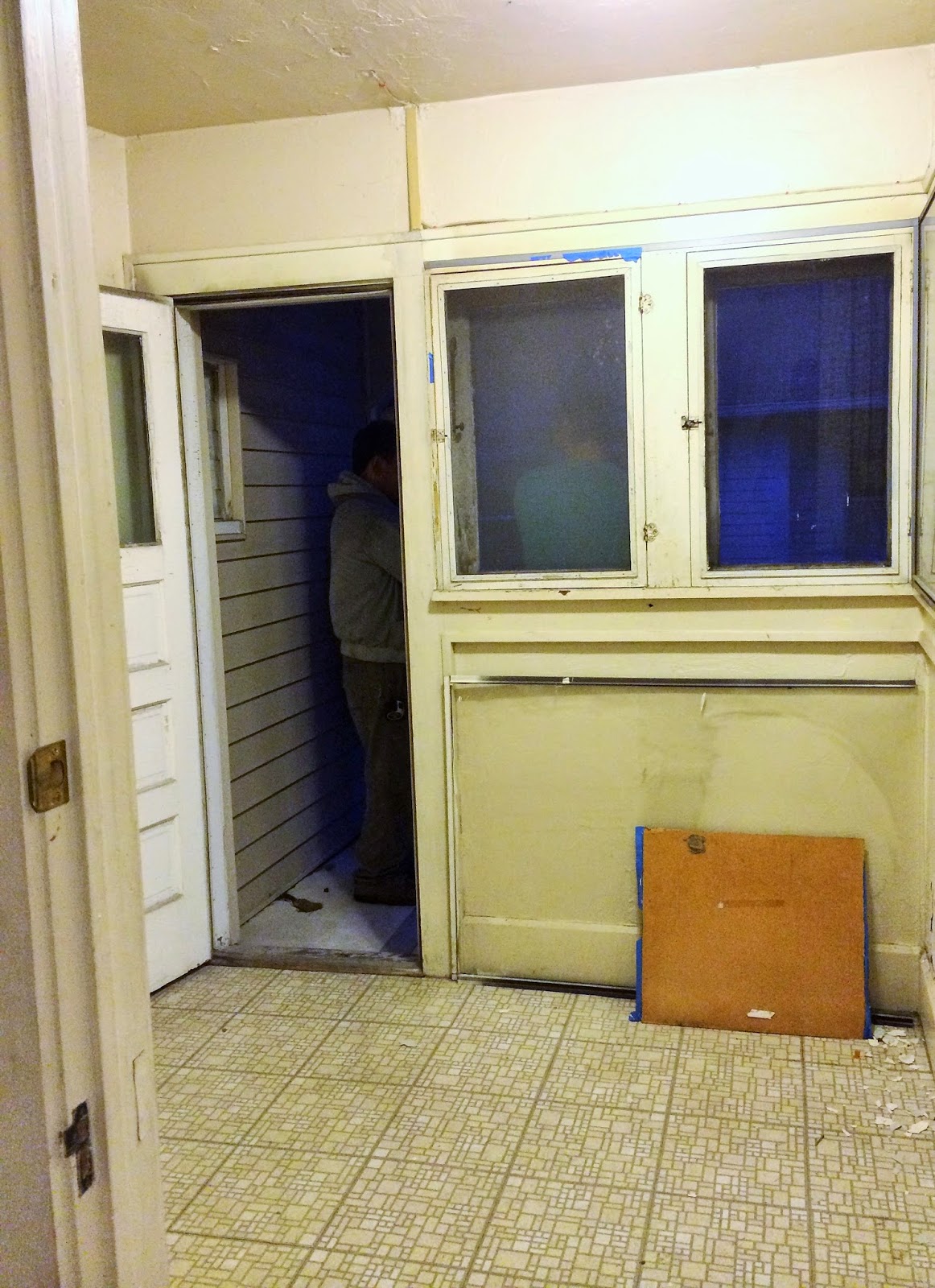
Mudroom + Bathroom


Master Suite + Bathroom


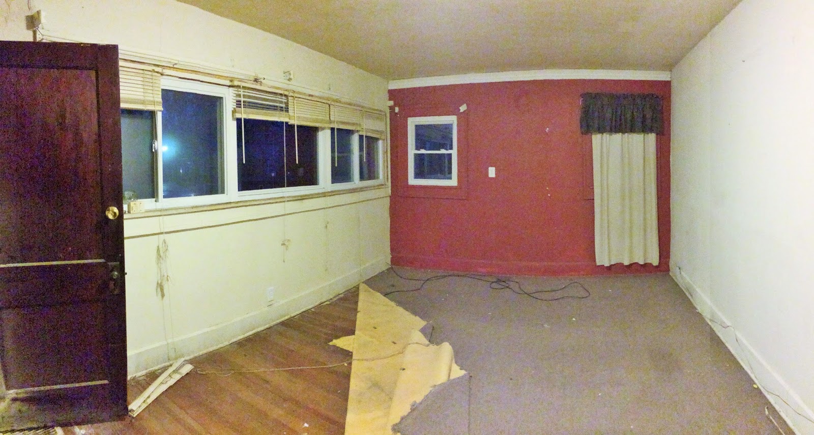
 This little room was basically an awkward little 'porch' like space that led you into the master bedroom.  So we took advantage of the space, added onto it and created a master ensuite.  


Second Floor Bedrooms + Bathroom

We decided to refinish all of the wood trim on the first floor and keep the dark stain, but on the second floor, most of the trim had been previously painted.  So, we decided to repaint it a fresh white, yet keep the doors the dark stain to mix the modern with the charm of the home.  Luckily, a lot of home was in really good condition so we were able to keep things like the original door knobs.


I mean, how adorable are these built-in storage, toy boxes that were in the home?  This home was filled with charm!


 Dining Room 


I am saving the kitchen reveal for the next post because it just deserves a post of its own!  Let's just say, it involves gray cabinets, white subway tile backsplash, carrara marble countertops, and lots of charm.  I am so obsessed with it!!  


SOURCES:  entire home was painted ALPACA by Sherwin Williams  //  all of the bathroom lighting is from Lowe's Home Improvement  //  master bathroom vanity is from Home Decorators Home Depot   //  master bathroom mirrors are from Lowe's Home Improvement


Related Posts Plugin for WordPress, Blogger...