Pages

Sunday, October 25, 2015

Gulf Shores Beach Condo: REVEAL!!

My clients made their trip from Indiana to Gulf Shores, Alabama to see their beach condo redesigned for the first time!!  

They had a few ideas of what I would do with the space because we discussed some ideas before I went on the trip.  But she mainly just left it up to me as far as how the final design all came together.  She saw a couple of 'sneak peeks' from Instagram, but that was it!  I really wanted this to be a surprise for them because I knew how much better it would be to see in person versus just pictures, so I made them wait......

Well, they "love, love, loved it!!"  Direct quote!


Instead of going through each space and talking about all of the details of the rooms, I am just going to leave you with lots of pretty pictures to look at of the newly painted and decorated Beach Condo.  

 
Originally, the plan was to purchase a neutral tan/taupe colored sofa.  Then I would bring in bright beach colors in with the accessories and accent chairs.  But as soon as I saw this teal sofa, I was in love!  The entire color scheme for the furniture changed and I am so glad I took the risk of purchasing this colored sofa.  I love how it looks with the original plan of a stripe wall in SW Sea Salt and SW Naval.


I planned to keep the homeowners original navy and white rug, but I loved this bright orange/red colored rug we found.  I thought I would keep the color palette to navy, white and turquoise.  But I didn't like how the existing rug was looking with the new teal sofa.  So out with the old rug and in came this bright, eye-catching colored rug.  I really don't think the space would be the same without it!


My goal was to make the spaces feel 'beachy' but also be a reflection of the homeowners style, similar to their home here in Indiana, so that they felt comfortable and 'at home' even when they are living beachside.  If you know my design style, I don't really do lime green, bright blues, bright yellows -- typical 'beach' home colors.  My version of  'beach style' is a little more rustic and sophisticated.


Of course there are coastal nods in the starfish patterned chair, coral sculpture decor, and rope accents.


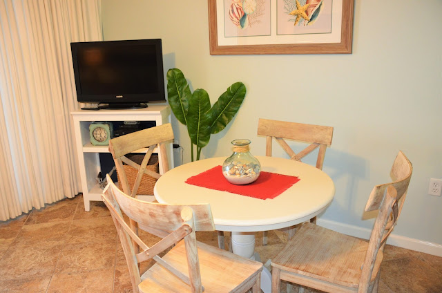
I can't tell you enough how much BIGGER this space feels without that HUGE hutch they stored the tv in.  And this piece of framed artwork tied all of our colors together.


Just a few decorative touches in the kitchen to pull all three spaces together....


Our 'list' of areas to re-design and decorate included the living area, dining room, and kitchen.  But we didn't stop there.  

You know how when you decorate one room of your house, the other rooms feel like now they need a makeover as well?  Well, that's how the half bath felt to us.  And since we had a lot of artwork from the living room and dining room that now we weren't using, we decided to decorate the master bedroom and half bathroom as well. 

AFTER

This was the old artwork from the living room, so we moved it into the bedroom.  The larger, framed artwork makes much more of a statement than the three little canvas prints.

BEFORE

BEFORE

AFTER

AFTER


We used the leftover paint from the striped wall and painted the bathroom.  The artwork really stands out on the dark navy wall now.


Later in the week, I will walk you through how we painted the stripes on the walls, some of our DIY projects in the space, and give you a full list of sources of all of the materials.


This project was SO fun!  I feel so grateful that I had the opportunity and was asked to fulfill this project for the beach homeowners.  I am fortunate enough to have great family that helped make this all happen as well.  Read more about this project starting with the design inpirations and all of our Gulf Shores adventures in my previous Gulf Shores posts!


Home-A-Rama 2015 Review: Old Town Design Group

(I've decided to split up each home into separate blog posts, so that it is easier and quicker to scroll through pictures and to go back and get the information in the future!  Scroll through to see each of the 5 homes on the 2015 Home-A-Rama home tour.) 


Home #5:  Old Town Design Group & Everything Home

There were a lot of new, surprising things from Old Town Design Group for me.  The homes overall color scheme and design style was a lot darker and more traditional than I typically see from them.  They have one of those building styles that is noticably their own.  I can spot one of their homes a mile away, normally, but this home was very different than what I am used to.  In a good way.  It is refreshing to see a new style and ideas from such a distinct neighborhood builder. (floor plans here)


The home office to the right, as you enter the home.


The powder bathroom to the left, with W A L L P A P E R!!!  Wallpaper is definitely back in style guys!


The kitchen was nothing to write home about, but I loved everything about the eat-in kitchen area. (except the chandelier.  A little too traditional for me.)


Beautiful dresser in the Master Bedroom.


Typically, I see a river rock tile like this on a shower floor, but I loved the rustic twist of running it up the wall as well. And who doesn't dream of having a rain showerhead?!?!


I HAD to snap of picture of this adorable play room, that also doubled as a home gym becase I have this same Ikea rug in my dining room.


A great display of sports memorabilia on the walls.  What guy doesn't dream of having this?!?


This faucet was REALLY neat!  I get giddy over stuff like this!


Another awesome barn door.  I love that you can hide away a secret bar or wine storage in a closet.  A really neat idea.


This shower wall material is new from Kohler.  It looks like stone, but it is actually a fiberglass composite in sheets.  Overall, Kohler is usually a more high end material, so I don't know how this compares to tiled walls in a shower, but when you have to add in labor, waterproof material behind the wall tile, and then the tile itself, this could be a very cost effective way to get a high end look in the shower.


This rustic, unique piece of artwork in the hallway was really beautiful!


Another great use for a barn door.


I love painting interior doors anything but white.  I chose a similar gray for basement doors in this Westfield project I designed.


Overall, I love touring these homes every year and getting inspired for my own design projects, but actually I was slightly disappointed this year.  I felt like the interior decorating was not as on point as the past.  There weren't a lot of new ideas or trends that I haven't seen before, and unfortunately, I just wasn't that inspired.

Each home of course was gorgeous and had its fun surprises.  I LOVED how KBD Home decorated and designed their home!  It was refreshing to see something different and fun from them.  I think my expectations were a little high this year because last years home tour was SO amazing!  It was a great day walking around on a Thursday afternoon, and overall every home was just gorgeous and so fun to tour!  It is always fun touring someone else's house!

Stay tuned for a list and pictures of a round up of all the details and reoccurring design trends I noticed in all 5 homes.


Last years Home-A-Rama was located in Westfield, IN in the neighborhood of Brookside.  Next year, Home-A-Rama tour will be back in Westfield in the Chatham Hill neighborhood.


Related Posts Plugin for WordPress, Blogger...