Pages

Showing posts with label Sherwin Williams Passive. Show all posts

Thursday, July 14, 2016

To the Moon and Back: Nursery Design Board

It's a race to the finish line now that we have decided to decorate our baby boy's nursery with moons and stars.  I may not get every last detail finished and hung on the wall before he arrives, but he will at least have a painted room and a crib to sleep in (or not to sleep in).  I started with this design board below, but as I started buying these items, I've been finding some items unavailable or changing my mind on some things.

Original Design Board for Baby Marhoefer


Now that I have started buying items for the nursery, the design board has changed a bit.  It still looks very similar and has the same style and feel, but the actual items I purchased are not these exact items pictured in the Origianl Design Board.  

New Design Board


Overall, the colors for the room are pretty simple and neutral -- white, black, gray, some brassy gold accents, and a lighter amber wood color and texture.  I wanted to keep the colors simple and masculine.  This space has room to grow in the future as well.  With everything so neutral now, I am hoping these are items we can keep and use for years to come!


Nursery Furniture and Decor Necessities:


ROCKER:  I would highly suggest splurging on this furniture item the most out of everything you buy for a nursery because you are going to use it every single day.  And hopefully can keep it for baby #2.  I decided to get an upholstered Rocker/Recliner from Buy Buy Baby for extra coziness and comfort for 3:00am snuggles.


CHANGING TABLE:  If you have the space in your baby's nursery, opt for a dresser instead of a changing table.  It can grow with your child throughout the years and add a lot of extra storage.  It is generally the perfect height and size for a changing pad as well. 


CRIB:  I was blown away by the fact that cribs can range in price from as low as $80 from IKEA to $2000 and beyond for designer specialty cribs.  Even the ones at Buy Buy Baby seemed over priced at $600 to $1000.  Me, out of all people was very concerned at the design and "look" of the crib but new I could find something much less expensive and more practical for our budget.  Shop around the internet.  I found a brand called Babyletto cribs that I loved but were very expensive.  I found a cheaper brand that was just as nice and also made by the same Babyletto people sold exclusively at Wal-Mart, so I scored a designer "looking" crib for less than $200.

LIGHTING:  Multiple light sources are ideal for day and night and middle of the night feedings.  I am still deciding on the exact light fixtures, but I will be doing a ceiling light for the main light source and a table lamp for extra night time lighting that will be softer, accent lighting. 

STORAGE:  LOTS of storage!  In the closet, we added some extra hanging storage and a 6 cube bin for miscellaneous items.  I love having some fabric bins hanging around the room for toys, books, or to use as a hamper.  IKEA floating shelves are some of the most practical storage solutions I have seen for children's books.  I love that they display them like art.


One of the biggest changes between the two design boards is the removal of the bookcases.  As much as I loved these open etagere style bookcases, the room just started to feel very cramped with too many pieces of large furniture.  It can always be a furniture piece that we add later down the road if we want.  I found the perfect dresser to use as the changing table!  It was perfect, to die for!  Only problem is, it was over $1000 from West Elm!!!!  So I had to fall in love with something else.  Luckily, I found an almost identical match from Wayfair.com.


This vintage inspired constellation art from Urban Outfitters was the first thing I bought for baby's room.  I was hoping it would be the perfect focal art behind the crib.  But once it arrived, it was much smaller than I thought.  (Should have double checked those dimensions a little closer!)  So, I decided to hang that on another wall and ordered this gorgeous "moon phases" artwork for behind the crib from Joss & Main.  


I'm hoping all of the fabrics in the room will come together nicely once I get the fitted crib sheets and changing pad cover as a starting point.  These will be store bought from Land of Nod, while I am still debating some custom options for things like a crib skirt and boppy cover.  I haven't settled on any of the fabrics quite yet, though.


That's how I have been pulling this nursery together -- one decor/furniture piece at a time.  I am starting to feel a little under the gun to get it completed with only 9 more weeks to go.  But honestly, a baby doesn't need anything of this in the first few weeks of life, so I think we will be okay! :) 


Thursday, June 16, 2016

Baby Boy Nursery Design Options

Now that we have announced and everyone knows that we are having a baby BOY, I have been frantically designing a boy nursery.  Before we found out the gender, I put together baby boy and baby girl nursery design boards just to get the creative juices flowing.  I say frantically because deciding how to design this space and what theme I wanted to go with has been SO HARD for me!!  I am so indecisive when it comes to designing my own home.  Initially I was all over the place just because I liked so many different ideas!  You can see from my Pinterest board of nursery designs for boys.  

After hours and hours on Pinterest and every kids rooms inspiration website I knew of, I finally narrowed it down to 2 themes.  There were a lot of reoccuring design features that I was liking no matter what the theme was.  I just couldn't get my mind off of having a black accent wall in the nursery and having a neutral black, white, and gray color palette with wood tones.  So that really helped me narrow down the theme and design direction I wanted to go in.

As soon as I saw this wildlife wallpaper from Chasing Papers, I knew a rustic wildlife theme would be a top contender!  Googly eyes for days!  I loved it!

@mothermeg instagram
How adorably amazing is this wallpaper?!?!?  It also comes in a 'Wild Things' print with safari animals.  I have also seen this print as a fabric. 


I also found these items during my search for nursery theme ideas and fell in love with a moon and constellation theme.  I think this is a very different look for a baby boy.  I have said it time and time again, that I am not a fan of "babyish" nursery decor.  I knew I could make this theme really fun and adventurous for a little boy and a space that he could grow into and hopefully a space that sparks his imaginination. 

from Target's Pillowfort Collection

Celestial Map from Urban Outfitters
These two themes, Wild and Free and To the Moon and Back as I like to call them, really sparked my interest the most.  I felt like they could be similar in many ways, with similar furniture just different accessories.  I decided I couldn't really decide until I saw both visually through design boards.  

The 'Wild and Free' nursery theme is much more rustic with a woodland animals theme, focusing on bears.  There are so many fun things you can do with this theme -- wood tones, warm color palette, arrows, animals, fur throws.  It has a lot of flexibility and doesn't have to be overly 'themey.'


The 'To the Moon and Back' theme would be all about astronomy with a focus on moon and stars.  This theme also has a lot of flexibilty in the decor and I would play up more of the textures and patterns in this space.  Keeping the color palette very basic, but mixing lots of patterns with wood tones thrown in for softness and masculinity.  


Both nursery ideas would have a black accent wall.  I love the boldness of this.  Both would have a modern white crib with a two-toned wood feature.  I love the dapper gentlemens look mid-century modern furniture lends to a nursery.  So a mid-century dresser as the changing table is a must.  I have been obsessed with using a dresser like this for a boy's nursery for a while now, so it was a must.  

I love so many elements of both of the nursery designs.  This is going to be a really hard decision.  Here are some real-lfe nurseries and design boards I found online to visually get a better idea of what I wanted for the space.  (Can you tell I have been overthinking this for way too long now?!?)

Lay Baby Lay nephew's nursery


black & white nursery from Little Gatherer

Lay Baby Lay Woodland Wonder


Kaiven's Space Nursery


Lay Baby Lay Rocket Baby


After much deliberation and my husband and I actually choosing the same theme, I have finally landed on a decision and a firm design plan for the nursery.  But you will have to wait until the next post to find out what it will be..........

Until then, here is a sneak peek of the black accent wall my mom and I painted (yes I used no VOC paint so I could help).  I am loving it!  I was SO afraid it would be too dark and make the room feel smaller but it definitely didn't.  It is just the look I was after.  We have no lighting in the room yet and minimal natural light, so this isn't a great picture.  

Paint:  Accent Wall - Sherwin Williams Tricorn Black 6258
Main Walls - Sherwin Williams Passive 7064


If you are looking for nursery design inspiration, these are my favorite websites, along with Pinterest of course!

(she has the BEST nursery design boards)

Thursday, November 5, 2015

Jack & Jill Bathroom Stripes

Painted stripes on a wall are one of my all time favorite ways to add BIG impact in a room.  


You can do horizontal stripes on the wall in just about any room of the house, including a foyer, bathroom, kids' rooms, playroom, dining room, or living room.  Depending on the room, you can change the paint colors to create the look you are going for.  And it goes with every design style from sophistated, to modern, fun kids' space.  Just make sure the two colors you choose are contrasting enough to really see a visible stripe. 

I saw this great idea on painting a Jack & Jill bathroom in coordinating horizontal stripes this year at the Indianapolis Home-A-Rama.  I was so excited when I came across this recent project that had the perfect space to recreate a similar look.

So here is the plan...hopefully this makes sense!  :)


The fun part of this plan is that I created a color scheme for 5 different spaces, that all coordinate together into one cohesive space overall.

Each bedroom has their own unique style and paint color -- one painted a minty green almost turquoise color and the other painted a light gray.

Here's the fun part...

We then swapped the same exact paint colors and painted each girls' bathroom the opposite color.

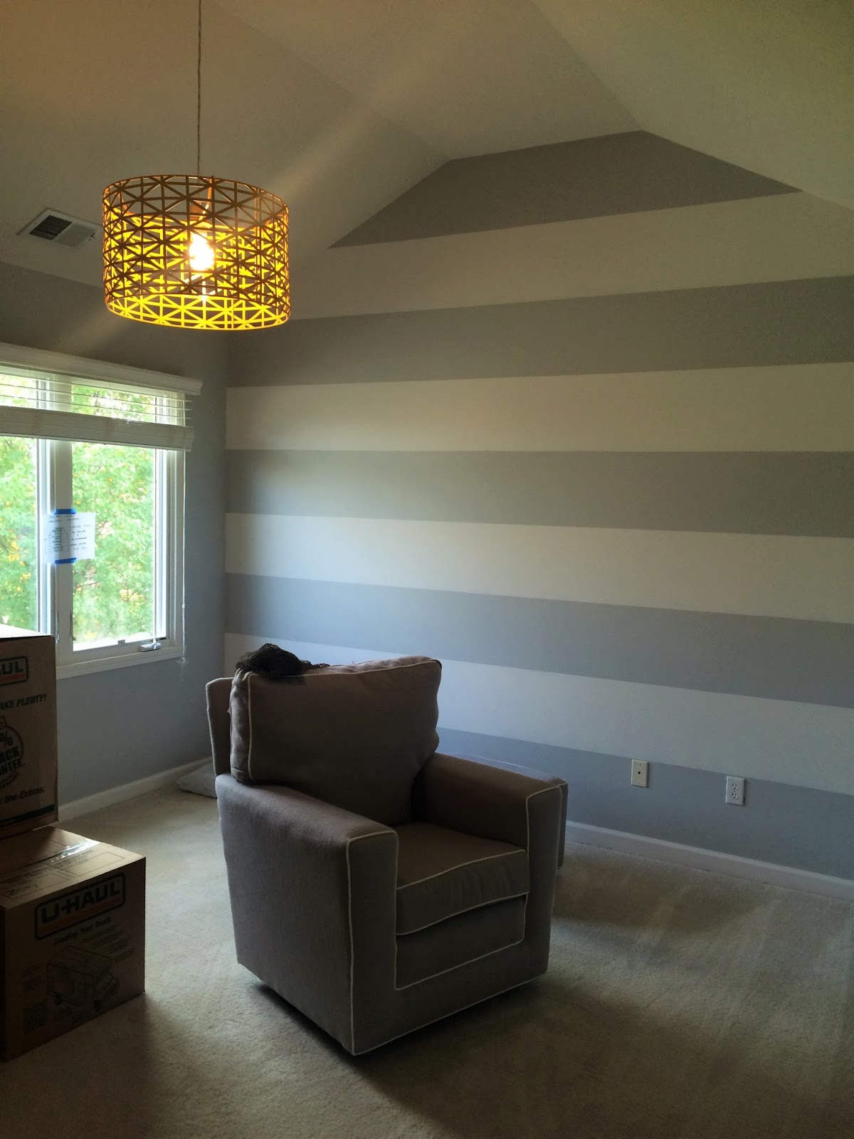
In the middle room, which houses the tub and toilet, horizontal stripes were painted around the entire room in both the paint colors of AT SEA (mint green) and PASSIVE (light gray).

How adorable and fun is that?!?  I love how it turned out.  It just brings the entire space all together!

Here is the Design Plan for each space with the paint colors.

Bedroom #1:
Lighting is from Shades of Light from the Young House Love Collection.  
Curtains are from Target.  

Bedroom #2:
Lighting is from Shades of Light from the Young House Love collection. 
Curtains are from Target. 

Each girl has their own space where their bathroom vanity is.  Then they share a room for the shower and toilet.  I think it would be even more adorable if they add in a third color into the design plan -- maybe a coral as an accent color.  Coral looks so pretty with both gray and mint green.

Bath towels all from Target.  Shower Curtain from World Market. 

Now, I didn't just pull these paint colors together overnight.  It took some planning, as any color selection should prior to painting.  

I LOVE choosing paint colors for clients!  It has kind of become my thing recently! But mint green can definitely be a challenging paint color to select.  A mint green paint color can lean too blue, too green, or even too bright!  There is nothing worse for me, than when you choose a paint color and it is WAY brighter and more bold than you thought!  It is always a real bummer!  (One day I will do a post on all of my favorite paint colors, and all of those pait colors to stay away from!  One day!) 

So, I headed to Pinterest and searched for the perfect mint green paint color.  I loved this shade of mint green I found from The Handmade Home website.   It was exactly what I was looking for, but you can never be sure of a color just by looking at a picture online because it can look so different in person.  The color she used is Benjamin Moore.  I typically use Sherwin Williams paint colors.  So I bought a paint swatch of this color, along with 3 more colors from SW and went to painting some test swatches on the wall.


This is a prime example of how pictures don't always do paint colors justice.  Because in person, these colors looked SO different.  


I painted the 4 colors in the room that will be painted this color, on the wall with the most direct sunlight.  I painted.  Let them all dry.  Painted a second coat.  Let them dry.  Then stared at them in different positions of the room until I could make a decision.  Originally, I planned on going with the far right color, until I saw it on the wall.  It was way too bright for my liking.  So, I decided to go with the color I found on Pinterest from Benjamin Moore called At Sea.  


Here is Bedroom #1 Before...


And the paint colors After...


So in love with this fun light for a kids bedroom!  It doesn't give off a ton of light because it is only one bulb, but it sure does look good!  The Large Wire Globe Lantern comes in lots of different colors, I chose Dark Teal, and it is under $99! 

Bedroom #2 Before...


And Bedroom #2 After painting...


(homeowners just moved in, hence the lack of furniture and boxes)


The Love Metal Strap Drum Pendant, also from Young House Love on Shades of Light website. also comes in lots of color choices and is under $99.  I chose the cheery yellow color called Hello Sunshine. 

Here is the bathroom area painted with the horizontal stripes in Sherwin Williams Passive 7064 and Benjamin Moore At Sea 666.


The key to this really working, is that the homeowner was on board with one daughters room being a fun, bright color, and the other daughters bedroom being a neutral gray.  This helps keep the stripes looking tasteful and sophisticated versus using two bold colors.  If you try this in your home, choose gray as one color, and any bright, fun color to go with it.


Jack & Jill bathrooms and floor plans similar to this are really popular right now.  So maybe you can use this same technique for your space.  It definitely helps that the kids sharing the space are both girls because I could use fun girlypaint colors.  But you could definitely pull this off with a girl and boy.  Even if you just painted each of their 'vanity' areas coordinating colors and then mix the two colors in the middle -- try navy and gray or kelly green and gray.  


Friday, February 21, 2014

Client Design Progress + Design Tips on Remodeling

The Kitchen + Living Room Design I am working on for a client is smoothly and quickly moving along.  At the beginning stages of design, it can seem like things are never going to happen and things move slowly.  But once that first coat of paint gets up, its like a quick non-stop process of shopping, making decisions, picking out fabrics, managing the entire project from start to finish!  It's a quick, fast-paced design world that I love!!

So here is an overview of how this project is coming along!

If you remember from this post, I chose navy and grays for this client as a basis for the overall design.  The navy and gray will be accented with punches of black and white, yellow, green, and turquoise!  It's going to be a vibrant, fun space for this young family!  


This whole design overhaul came about because of this kitchen...


Some MAJOR design features this kitchen was missing...


1.  The cabinet height -- tall ceilings but short 30" cabinets.  They have no crown or architectural detail at the top of the cabinets to give them height or interest.  

2.  The cabinet color - a basic builder grade cabinet in a natural oak.  I see these cabinets all the time and people just don't know what to do with them or how to decorate around them.

3.  Laminate Countertops - I want to give them a more durable natural stone countertop.

 4.  No Hardware on the Cabinets -- just some simple knobs or handles on a cabinet door adds instant style and interest to a kitchen.

5.  Wall Paint Color - Again a builder grade paint color that runs throughout the house.  The owners inherited this yellowish, tan wall color when they bought the house, but have never re-painted because they struggled with what color to choose. 


...and how I am going to fix it!

1.  Same cabinets - New look!  I am tricking the eye into thinking the cabinets are visually taller by adding architectural detail.

 
It is a little hard to see in this picture, but we added a 2x4 to the top of the cabinets for added height with a large crown.  Now the cabinets are almost 8" taller!  I love this trick for cabinets or even if you want to give it a larger crown height look.  It is a cheap and easy design trick you can do with existing cabinets or new cabinets. 

2.  Yes, we painted the cabinets white!  What a difference this makes!!


Look at the difference with that crown on the top and with the new cabinet color!  Wow!  It looks like a completely new kitchen!  The island was painted black for interest and to match the existing black appliances.  Now the appliances don't stick out like a sore thumb as much!

3.  The laminate was switched out with granite.  Venetian Gold granite.  There are future plans for a backsplash but we haven't gotten that far yet!


4.  The cabinets finally have some hardware on them to open the doors and drawers a little easier.  We chose brushed nickel to match the faucet and keep with the modern design style.  Knobs on doors and handles on the drawers.  Don't be afraid to use both together on your cabinets. 

5.  The ugly yellow, tan is finally gone!  Hello, GRAY!  I chose Sherwin Williams Passive 7064 for all of the walls -- that includes the living room, kitchen, dining room, entry way, up the stairs to the loft and hallways.  Some people think they have to do each room a different color, but I actually think picking just a couple of paint colors for the entire house is much more sophisticated.  Bring the color in with the accents and fabrics.


Always, ALWAYS put paint samples on the wall in your home before painting.  Especially if your chosen paint color is going in this many rooms.  Paint can look so different than the little swatch at the paint store and up on the wall in your home, in your lighting.  Especially gray.  Gray is such a hard color to choose because it can look too blue or even too brown depending on the undertones.  We were going for just a good solid gray!  I have used this gray before with past clients so I knew it would be perfect for them.  

SW Passive 7064

I am adding a little accent color with wall paint.  I chose Sherwin Williams Cityscape 7067 for an accent stripe in the living room which you will see a little later.  

But here is what the kitchen now looks like with the walls FINALLY painted gray!


 I am loving this soft gray color.  You can tell the walls are definitely "gray" but it is still light and bright.  There is a lot to do yet and it is still a work in progress as you can see.  But we are moving along quickly!  So that is where I am with this client design! I'll keep you updated with more info as we move along! I think it already looks 100% better!


Here are some fabrics I am throwing around....for curtains in the living room, valance in the kitchen, and maybe some throw pillows on the couches!


Related Posts Plugin for WordPress, Blogger...