

I am going to show you the before photos of each room first, to give you an idea of the state of the house when I first started working with it. This home was already in great shape -- great bones as we say, but it was very outdated. When it comes to buying a home and thinking about remodeling it, the most important areas to focus on are the kitchen and the bathrooms. Those rooms can quickly become outdated and will give you back the most return on your investment. I am so proud of the 'after' of this project. It turned out to be an incredible transformation. This home went from outdated to a functional, modern home with some of that farmhouse style the client wanted.
I am starting with the kitchen. Because after all, that is the heart of the home and the most important room of the home. And this room took on the biggest transformation.


We started with great cabinets in the kitchen, but not the style the client was going for. There was a lot of wasted cabinet space with the short cabinet height of the wall cabinets, so we took the new cabinets to the ceiling. And the varying cabinet heights are really a thing of the past so we got rid of that. There was space for a larger island, so we increased the size of that as much as we could in the space. Overall, we kept the footprint of the kitchen the same, just updated the look and added a little more personality to the space with all new cabinets. You will notice that all of the trim in the house was painted white also. There was a wall knocked down to the left of the double ovens and then we extended part of another wall to create a 'mudroom' with built-in lockers. We removed the sliding glass doors to the exterior and added french doors.


I love the side detail of this island. The homeowner wanted some farmhouse style throughout the home so the contractor actually custom built this "X" end to add detail to the island. The cabinet manufacturer sent extra paint to ensure the exact same greenish-blue turquoise of the island cabinets. You can also get the paint matched at your local hardware store to get a similar look. Just this simple add-on added SO much personality to their kitchen.

We didn't want the countertops to distract from all of the unique details of the island or the backsplash, we really just wanted to keep a clean, simple look for the countertops. So I chose a white quartz countertop that mimics the look of marble.


It's a little hard to see in this before photo but off to the left of the kitchen, there were two bi-fold closet doors for a pantry. I talked the homeowners into creating a butler's pantry on one side of this niche of the kitchen and then we kept a pantry cabinet on the other side. The door in the middle leads to their laundry room. I thought this was the perfect space for a butler's pantry, which is great for wine storage, glassware, and entertaining. I love how this space turned out. It is a little unexpected gem in the kitchen!


Besides the overhaul of the kitchen, the dining room was another major transformation of this home. While most people would have seen this feature of the home and ran, this family saw past the multiple pillars throughout the dining room, entry way, and living room, and saw potential for the home. Thankfully they did and thankfully we were able to come up with a fantastic plan to get rid of the many pillars.

You can see more of the pillars in this before photo, off to the left.

As you can see, where typically we want to tear out walls to create an open floor plan, we actually decided to add walls to create a more formal dining room -- and to get rid of the hideous pillars!!


The living room just needed a little paint and new flooring, but wow, what a difference that made! We did tear out a wall, to the left, to open the space more and to be able to see into the living room from the kitchen.


I curated and installed the gallery wall for the homeowners using a combination of their items and frames they already owned, and frames and decor that I found while shopping.


Just off the entry way, is the home office. Originally it was open to the rest of the house, so we decided to add french doors for a little more privacy. The walls were painted a dark gray/green color for a more masculine look. I love painting office walls darker for a more moody, masculine look. All of the trim was painted white to match the rest of the house and the ceiling fan was removed. I designed custom built-ins behind the desk for optimal storage including open shelves and file storage.


Bathrooms are one of my favorite things to design because there are so many different elements that build on one another to create such a unique space. I love to think through every detail of these small spaces to make them extraordinary. And when you get to include wallpaper, it just doesn't get any better than that!!

The powder bathroom got a major rehaul with new flooring (the same wood as in the living room and kitchen), new pedestal sink, plumbing fixtures, mirror, lighting, shutters on the window, trim painted white, and that WALLPAPER!!! We covered all of the walls of the powder bathroom in this gorgeous taupe colored wallpaper with a simple moroccan quatrefoil pattern.


There wasn't much worth saving in the guest bathroom. I wanted to keep the pink tub, but I was out voted to demolish it! ;) Everything had to go!! Which gave me a blank slate to design a new guest bathroom.

We decided to rip out the old vanity and replace it with a completely new one because the sink was actually off-center and the only way to put the sink in the center, which makes so much more sense, was to insert a new vanity cabinet. We chose a traditional style but kept it modern with a very light colored gray/taupe paint color. We were actually able to salvage some of the granite from the previous kitchen and cut it to fit this bathroom vanity.
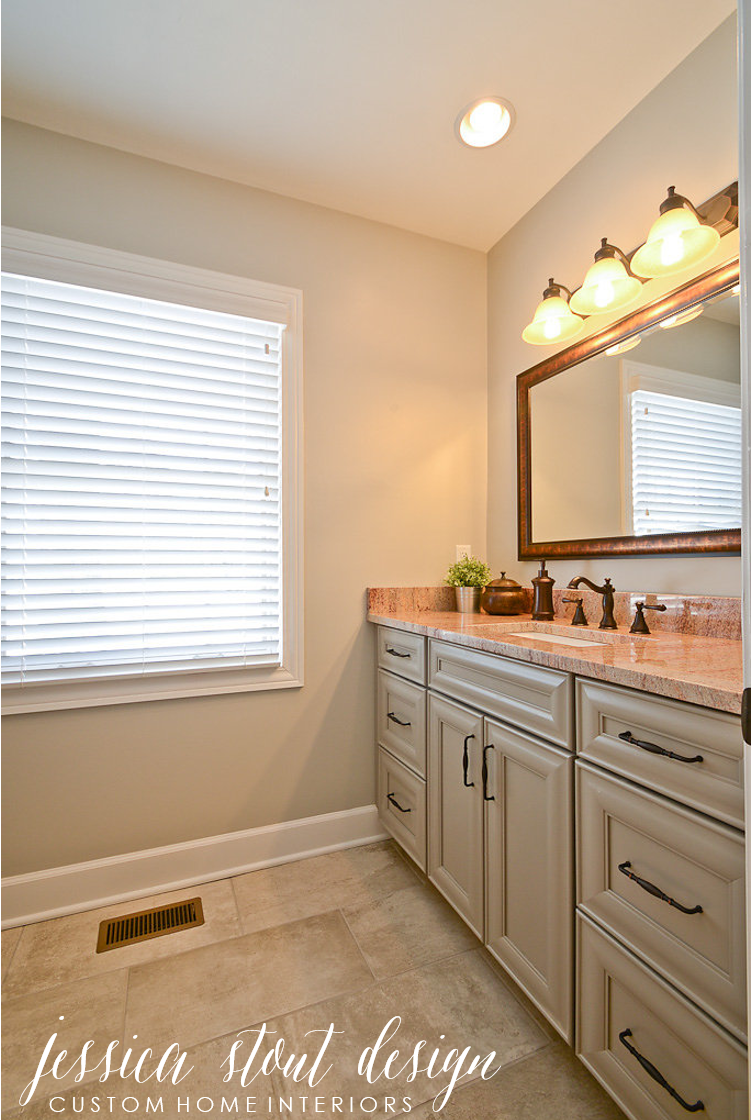
We kept the tile floor light with light cream and taupe colors in it. The shower is classic and timely with 3x6 white subway tile to the ceiling. Oil rubbed bronze plumbing and hardware was chosen for a traditional style.


These kids are so lucky to have their own bathroom that they won't have to share with their siblings when they get older! They have no idea how great that is going to be!! :)


There I am,working away!! :) Both bathrooms received minor updates which included new flooring, vanity cabinet, countertops, sinks, mirror, lighting, faucets, and paint.


Before, the master bedroom was pretty basic. Four white walls with carpet floors. The homeowner was looking for a little more pizzazz so we opted for a dramatic accent wall in grasscloth wallpaper. The bed was chosen from Birch Lane to really stand out as a feature against the wallpaper. Together, it created a sophisticated, gorgeous bedroom retreat.


Now let's talk about this bathroom! It definitely needed some help with aesthetics and on the functionality side.


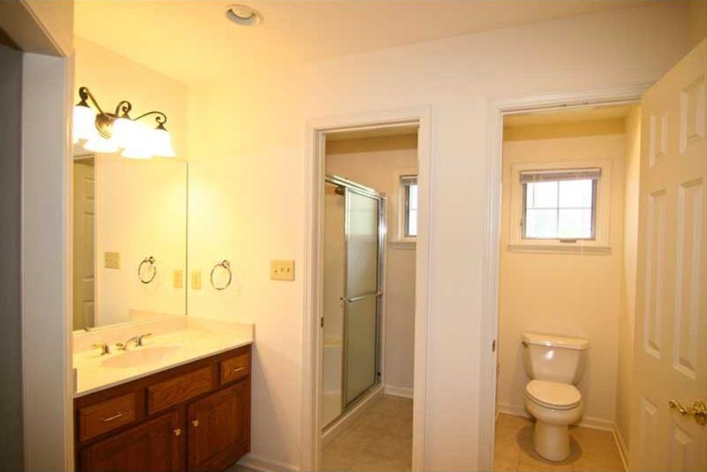
Before, the master bathroom had a really weird layout. There were two walls right when you walk in to the left and right, really blocking your view of the bathroom. Those were the first things to go, which completely opened the space and made the bathroom feel bigger. The second issue that had to be addressed was all of the separate rooms within the bathroom -- the toilet room and the shower room. There was so much wasted space with how the shower was laid out in a separate space. We decided to remove the walls of the 'shower' room and change the layout of the shower to make it bigger.

Now you walk in, and can see that beautiful shower! We chose finishes to lend toward a sophisticated modern farmhouse style. It is very polished with the white cabinets and chrome accents, but uniquely personalized with the tile choices.


The large hexagon tile was chosen in 3 color variations and strategically organized in this pattern to create a one-of-a-kind flooring design.
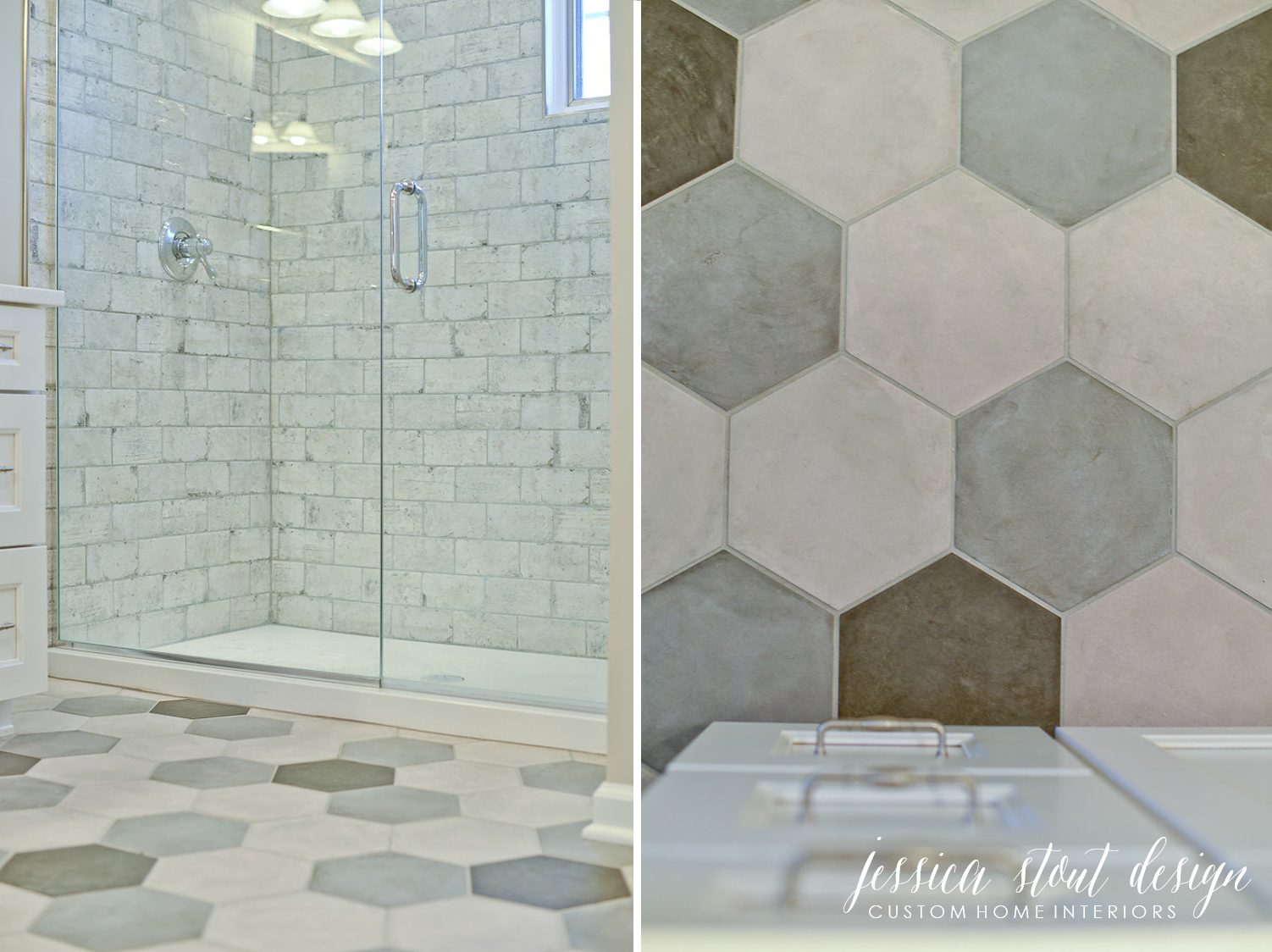
Also, as you can see below, the awkward bump out in the wall against this vanity was closed and straightened out to create a more seamless look. We took advantage of the space we closed and created a decorative niche for towels and decor.

The basement got some minor updates but was still a major overhaul as well. New, fresh carpet, new finished ceiling, paint on the walls and trim, and recessed lighting in the ceiling.


PAINT COLORS:
Trim, Custom Built-ins in the Home Office, & Mudroom Custom Built-ins: Snowbound SW 7004
Main Color throughout the house: Repose Gray SW 7015
Dining Room: Granite Peak SW 6250
Home Office: Walls - Adaptive Shade SW 7053
Back of Bookcases - Gray Area Sw 7052
Son's Bathroom: Tinsmith SW 7657
Daughter's Bathroom: Grassland SW 6163
Master Bedroom: Tony Taupe SW 7038
Master Bathroom: Accessible Beige SW 7036
**All of the beautiful decorating and furnishing of the home was done by the homeowners with furniture they already owned or new furniture they purchased. The photo gallery wall in the living room was created and installed by JSD.**
**All photos of completed renovation by Mimi Barry Photography**
**All photos of completed renovation by Mimi Barry Photography**

GORGEOUS!!! That is a huge transformation!! Such a pretty home!
ReplyDeleteThanks Val! It was a big project!
DeleteYour blog is so good and informative for everyone.I really like it.Keep it up admin
ReplyDeleteGranite walls and counter tops manassas va
I really thank you for the valuable info on this great subject and look forward to more great posts. Thanks a lot for enjoying this beauty article with me. I am appreciating it very much! Looking forward to another great article. Good luck to the author! All the best! 3d innovations - renovation singapore
ReplyDeleteSimply you did an awesome home renovation projects. The photos of rooms, floor, bathroom look incredibly wonderful.
ReplyDelete