In my last post I talked about how much I am loving the trending color combination of Navy & Gold. It really is a traditional, classic duo that looks sharp and sophisticated with just the right amount of antique character with some aged brass thrown in. {see the whole Trend Spotting...Navy & Gold post here}
So, when a recent design project of a Home Office was presented to me a couple of months ago, I knew this color palette would be the perfect combination to this classic style home.
Let's take a look back at the initial Mood Board I started with for the clients.

{See the entire design process here.}
The office is mainly used by the husband. So I wanted to do a traditional, manly home office. Think sophisticated gentleman's club vibe! However, the rest of the household -- wife and three young boys, would also be using the space from time to time. So, it had to be for the entire family, with the husband's wants and needs coming first!
Here's one last BEFORE picture before we check out the amazing transformation.


The client's boys aren't babies anymore, but they love these professional pictures they had taken of them when they were all babies. So they were custom framed and hung in a row to give them a cohesive look.


It is hard to see the artwork on this wall but I loved it! It is a piece from Art.com. The husband loves Abraham Lincoln, so there are a lot of nods to him throughout the space. I chose this specific piece of art because it wasn't just a big portrait of Abe, like in your face! It is a more subtle way of bringing him in with the artwork.

Remember how their desk lamp used to look? Silver! Well, I gave it a little makeover too. With just a can of spray paint, it now looks brand new! By chance, the homeowner's existing desk lamp is very similar in style as the sconces I chose for the bookcases. So I am glad we decided to keep it, and just change the finish.


I went back and forth on whether to do a settee in this space for the seating area, or two chairs with a side table in between them. I liked both options. I love settees and I don't think they get used enough. So I left this one for the client to decide. Either option would be about the same price depending on the pieces we chose, so that wasn't a factor.

So, after much deliberation......we all agreed the settee would look the best!! {See how we weighed the PROS and CONS of chairs vs settee here.}


Last minute, we decided to add some lighting to these bookcases! It really adds the wow factor this room needed! {See how that came about here.}

We also added navy grasscloth wallpaper to the back of the bookcases! LOVE! I would use grasscloth in every room if I could! It really gave the room that pop of color it was needing since we kept the walls a warm taupe color. And it added a level of sophistication to the space.

 |
| sconces via Ballard Designs |


The counter top of the bookcases was stained versus painted to bring in some richness to the room. It also coordinates with the stain color of the desk and the two new side tables which makes all 4 pieces now cohesive. The husband made this entire section/bookcase/furniture piece all by himself, by hand! He far beyond, exceeded my expectations! And it was actually his idea to stain the top like this! Kudos to him!


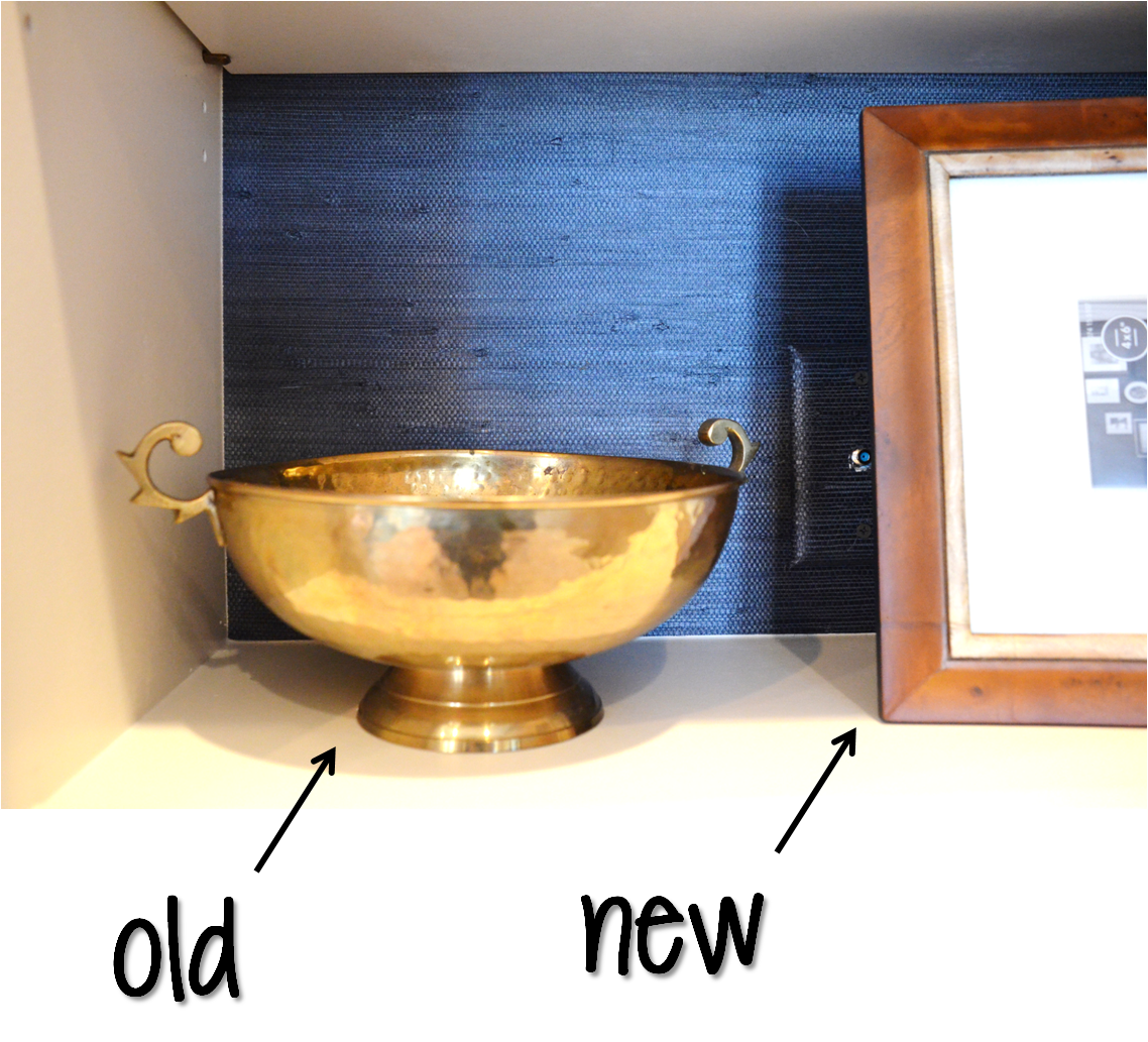
The accessories in this space were a HUGE factor! They are the main focus in the bookshelves, so they had to be meticulously chosen to give the space its own personality. I did a mix of old and new. Some antique and thrift shop finds, mixed in with some new decor from Target. The "old" adds in the character and story the "new" may lack.


This Abraham Lincoln art I made! I just ran a sheet of dictionary paper through my printer, selected a picture from Google Images that I wanted to use, and printed! I printed one of George Washington as well, for one of the other shelves for a reoccuring theme.

I love all the little details that go into decorating bookshelves. Like these pheasant feathers I chose to fill this gold vase from Target.


Another Abraham Lincoln quote!


I loved how the homeowner just stood and stared at the his bookcases he made filled with all of the perfect accessories I chose for them. He made me go through and tell him which piece was old, picked up from antique and thrift stores, and which pieces were new! I loved how the new and old gold and brass tones blended together so seamlessly, he couldn't even tell!


You get the idea!
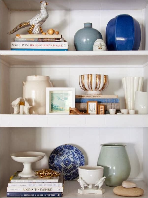
This space really started with the bookcases. Everything was designed around them. So I have to give a HUGE shout out to Thrifty Decor Chick who inspired me on the design of the bookcases.

These are her bookshelves in her Dining Room that she built herself with the help of some pre-made base kitchen cabinets. Hers are beautiful and was a great inspiration for my client's Home Office Makeover!